

OTI
CASE STUDIES
Uniting Art, Finance, and Tech
NOW
QUALITY
We are dedicated to delivering high-quality solutions that exceed your expectations.
NOW
INSPIRATION
We stay ahead of the curve, constantly exploring new ideas and pushing boundaries
NOW
QUALITY
We are dedicated to delivering high-quality solutions that exceed your expectations.
NOW
INSPIRATION
We stay ahead of the curve, constantly exploring new ideas and pushing boundaries
The brand identity, strategy, and messaging has been designed to represent Provenance’s deep understanding of the Digital Asset Space and position it as am expert in the Web3 ecosystem.
THE CHALLENGE
Provenance aims to establish a bridge between digital assets and asset management, assuming a pioneering role in connecting art enthusiasts and savvy investors. OTI has meticulously crafted the brand identity, strategy, and messaging to embody Provenance's profound comprehension of the crypto community and its stature as an expert in the Web3 ecosystem. The branding distinctly mirrors Provenance's core values of Trust, Safety, and Growth.

THE SOLUTION
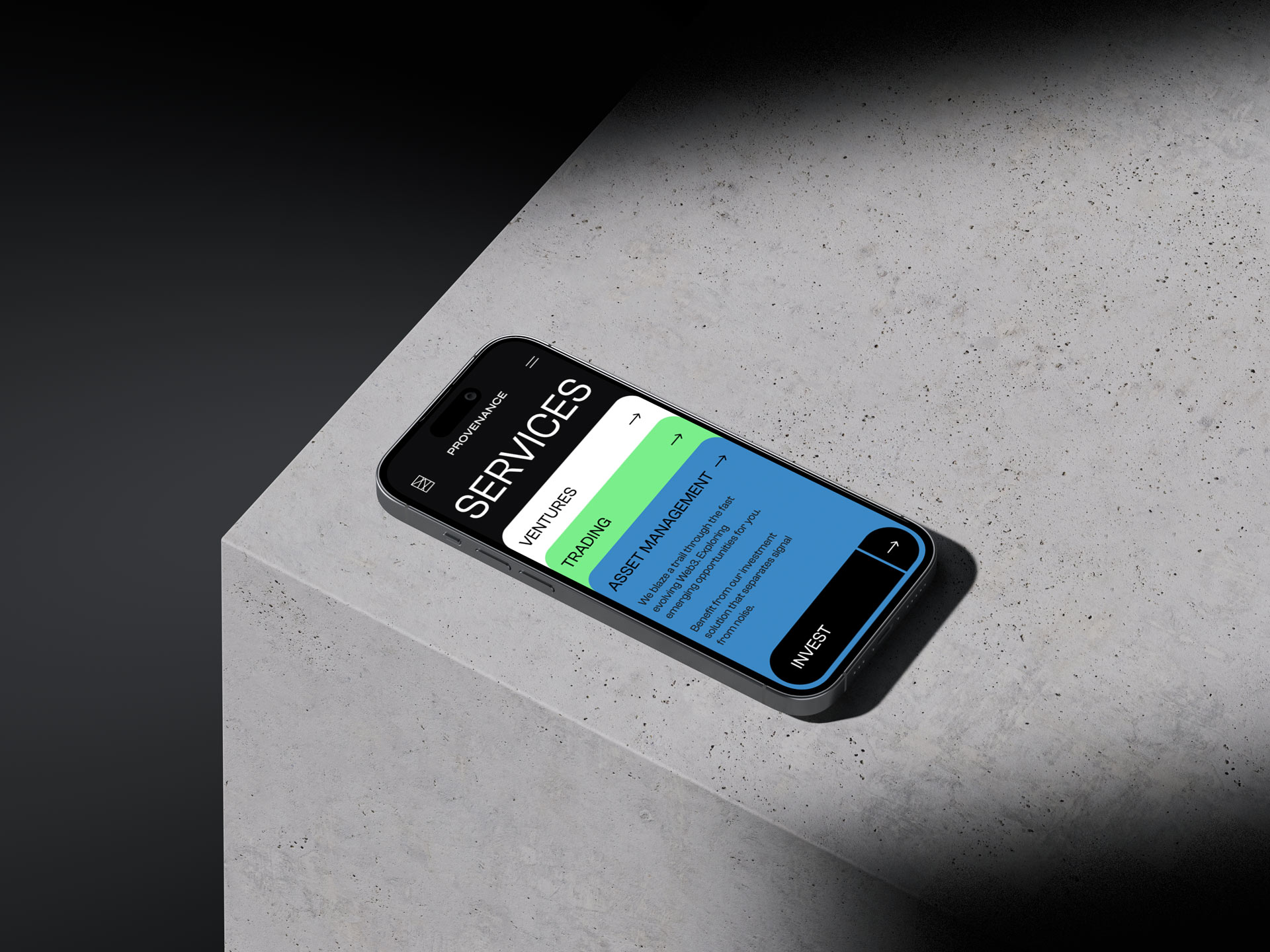
At its heart, the fresh identity centers around a novel logo, crafted as an homage to the realm of cubist art. By employing minimalist lines and a rectangular frame, this emblem embodies a harmonious fusion of the contemporary and timeless, seamlessly blending digital assets with artistic expression. These elemental shapes evoke the abstract canvas of a painter, symbolizing the multifaceted roles Provenance plays in the crypto sphere – explorers, guides, technologists, and guardians all at once. In the spirit of the Web3 movement, this symbol possesses the remarkable ability to morph into an infinite array of variations, each tailored to represent the diverse use cases across various media. Beyond aesthetics, this logo serves as the unifying backbone for all communications. Our fresh visual direction for communication and infographics takes these shapes to a whole new level, transforming them into intricate networks of interconnected graphic elements. These components are ingeniously employed to illustrate the intricate concepts and cutting-edge technologies underpinning the crypto and blockchain domains.

THE STRATEGY
Provenance is constructing an all-encompassing financial platform for a digitally fluent universe. As a guiding light within this expansive realm, the brand serves as a beacon for an increasingly diverse and expanding audience, helping them chart a course through the untapped possibilities of the digital landscape. By shedding light on perspectives, simplifying intricacies, and providing steadfast guidance through this uncharted terrain, Provenance strives to emerge as the ultimate authority within this ecosystem. Provenance’s mission is to demystify the forthcoming era of finance and technology.

At the core of our solution is a groundbreaking logo that seamlessly combines digital assets with artistic expression, symbolizing Provenance's diverse role in the crypto world.


The symbol possesses the remarkable ability to morph into an infinite array of variations, each tailored to represent the diverse use cases across various media. Beyond aesthetics, this logo serves as the unifying backbone for all communications.
FINAL THOUGHTS
This project showed how challenges can be overcome in a world where art, finance, and technology often operate separately. Our meticulous design mirrors Provenance's mission to break down barriers between art, finance, and technology, exuding creativity and distinctiveness.
Provenance
Quartz has been a game-changer for my photography career. The platform not only showcases my work beautifully but also provides a seamless user experience for visitors. It's a hub of inspiration and connection with a vibrant community of fellow artists. Thanks to Quartz, my portfolio has reached new heights, and I've received incredible opportunities. Highly recommended!"
